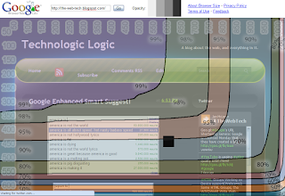
Browser Size
Google today released in their blog, Browser Size, a free webdeveloper tool.
Alot of web designers make their website based on the screen they have on their home computer, which unfortunatley for the rest of the world, web designers usually have higher quality computers and monitors than the average user. Unfortunate because websites made for bigger screens, require scrolling for the users with smaller screens :(
Google today wanted to help fix that with a web app that lets web developers see their site somewhat how users on computers with smaller screens would.
Now days a lot of sites use percentages instead of using exact pixel locations for the designs, this makes the site more compatible on smaller screens because the site automatically attempts to adjust to the monitor of the user, this can also make the site look hideous however if the site is squeezed too much.
For most websites the site will sort of auto adjust to the users monitor, without any effort by the developer, however this isn't always the case.
Google Browser Size will help you with that!
There is one downside though that I can clearly see, the lines were poorly drawn in the overlapping image. Also it would be better to use something like browsershots for something like this because the resolution isn't adjusted with it.
What I think would be better than the current system Google Browser Size Uses, is a system that takes several screenshots of your site(or creates Iframes with your site in it.) that overlap, showing your site in each size, mouse over the frame and that will be the frame thats in focus, that way you can see your site clearly in all screen sizes. Note: if anyone makes an app like this please link it to me I'd love to try it, and I would probably post about it.
Image by Hobo! via Flickr

Comments
Post a Comment
Leave a Comment and you may just win a google Wave Invite!